Call-to-Action (CTA)
A Call-to-Action (CTA) is your digital salesperson, guiding users towards a specific action you want them to take. It’s that button or link that says “Sign Up Now” or “Get Started” – the bridge between interest and action in your user’s journey.
How it works:
Creating an effective CTA is both an art and a science. Here’s how I approach it:
- I start by clearly defining what I want the user to do next.
- Then, I craft a message that’s clear, compelling, and action-oriented.
- I make sure the CTA stands out visually – contrasting colors work wonders.
- Placement is key – I put CTAs where users are most likely to engage with them.
- Finally, I track performance and continuously refine based on the data.
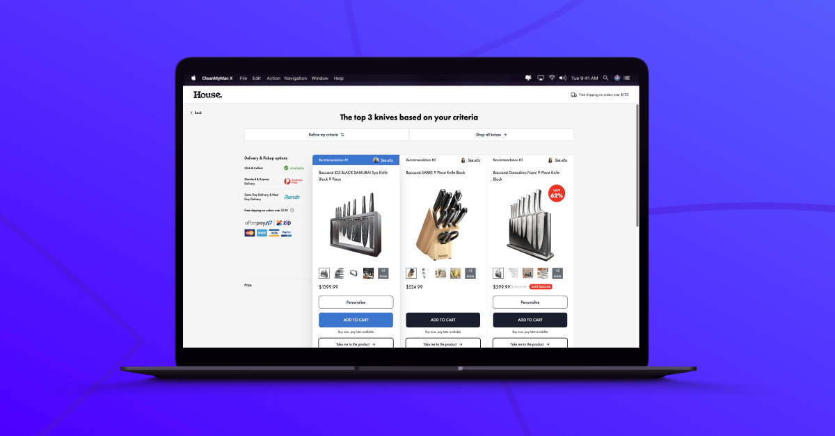
At Convincely, we’ve taken this a step further. We’ve developed a system that creates dynamic CTAs that adapt to each user’s behavior. It’s pretty cool stuff.
Why you should use it:
CTAs are absolutely crucial in the digital world. They:
- Guide users towards conversion
- Clarify the next steps in the user journey
- Help measure the effectiveness of your content
- Ultimately, drive business results
How it fits with personalization:
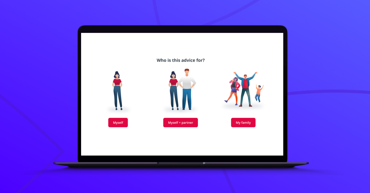
This is where things get really interesting. By combining CTAs with personalization, you can create prompts that are tailored to each user’s behavior and preferences. It’s like having a salesperson who remembers every interaction they’ve had with a customer and adjusts their pitch accordingly.
Getting started:
If you’re looking to optimize your CTAs, here’s what I’d suggest:
- Identify the key points in your funnel where you want users to take action.
- Write clear, action-oriented copy for each CTA.
- Make your CTAs visually striking – they should pop off the page.
- Ensure they’re easy to spot and click, especially on mobile.
- Start testing different variations – copy, color, placement, you name it.
- Keep a close eye on your analytics and keep refining.
For some great examples, check out our funnel database. You’ll see how other businesses are using CTAs in clever and effective ways.
Remember, a great CTA isn’t about being pushy – it’s about being helpful. It should feel like the natural next step for your user. At Convincely, we’re always working on making CTAs that feel less like a sales pitch and more like a helpful suggestion.
The real magic happens when you make your CTAs dynamic. We’ve developed a system that adjusts CTAs based on user behavior. So if someone’s been reading about a specific feature, we might change the CTA to highlight that feature. Or if they’re a returning visitor, we might change “Learn More” to “Continue Where You Left Off.”
We can even adjust the language based on what we’ve learned about the user. If they seem price-sensitive, we might use “Start Saving Now” instead of a generic “Sign Up.”
It’s all about creating a personalized journey for each user. Your CTA should feel like a helpful signpost, always pointing them towards the next step that’s most relevant to them.
This approach has been a game-changer for us and our clients. It not only improves conversion rates but also enhances the overall user experience. And in today’s digital landscape, that’s what it’s all about – creating experiences that users actually enjoy.


