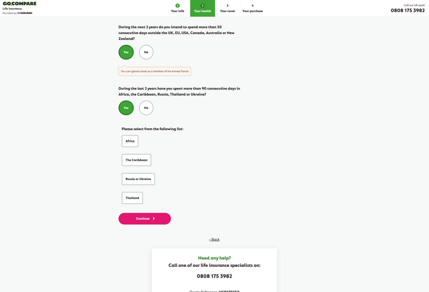
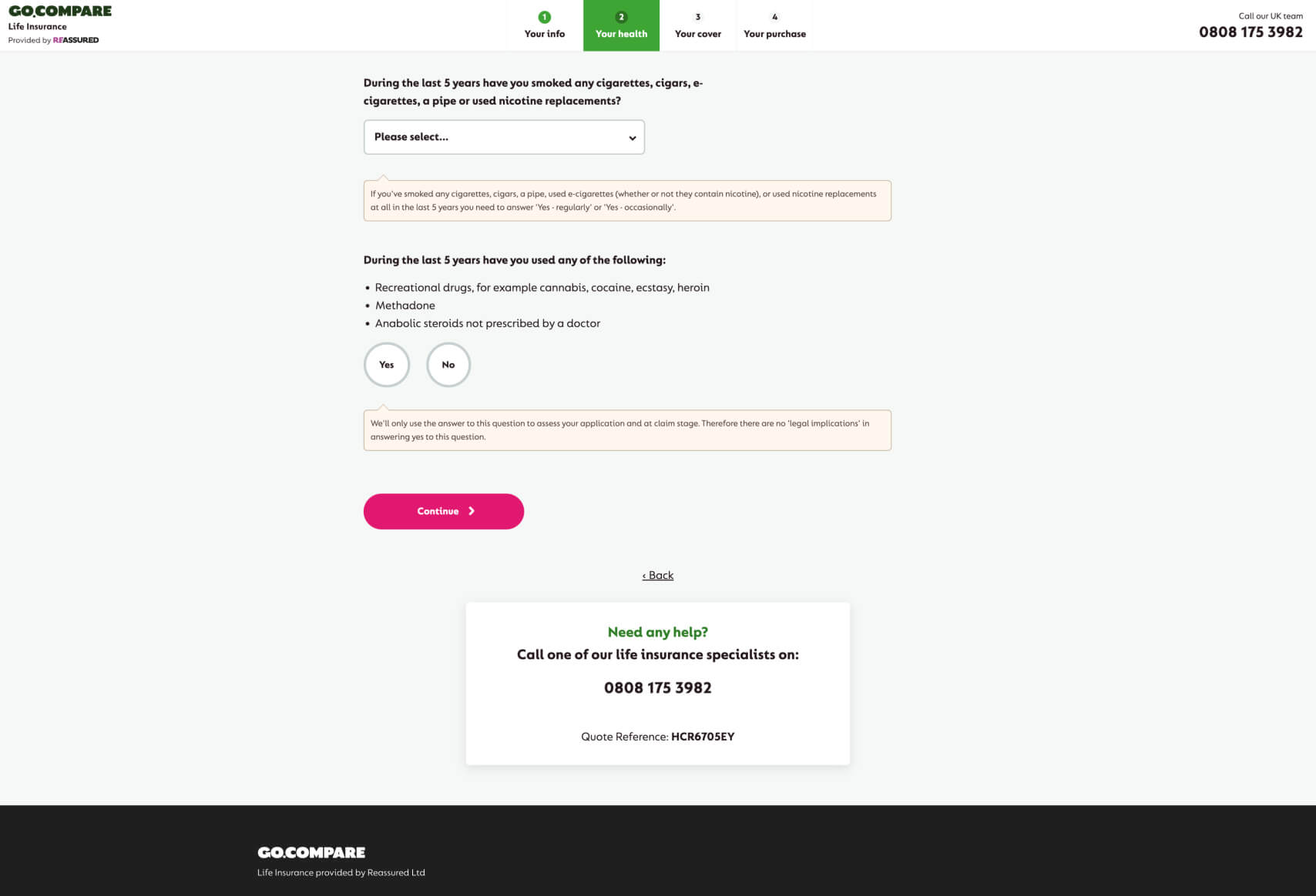
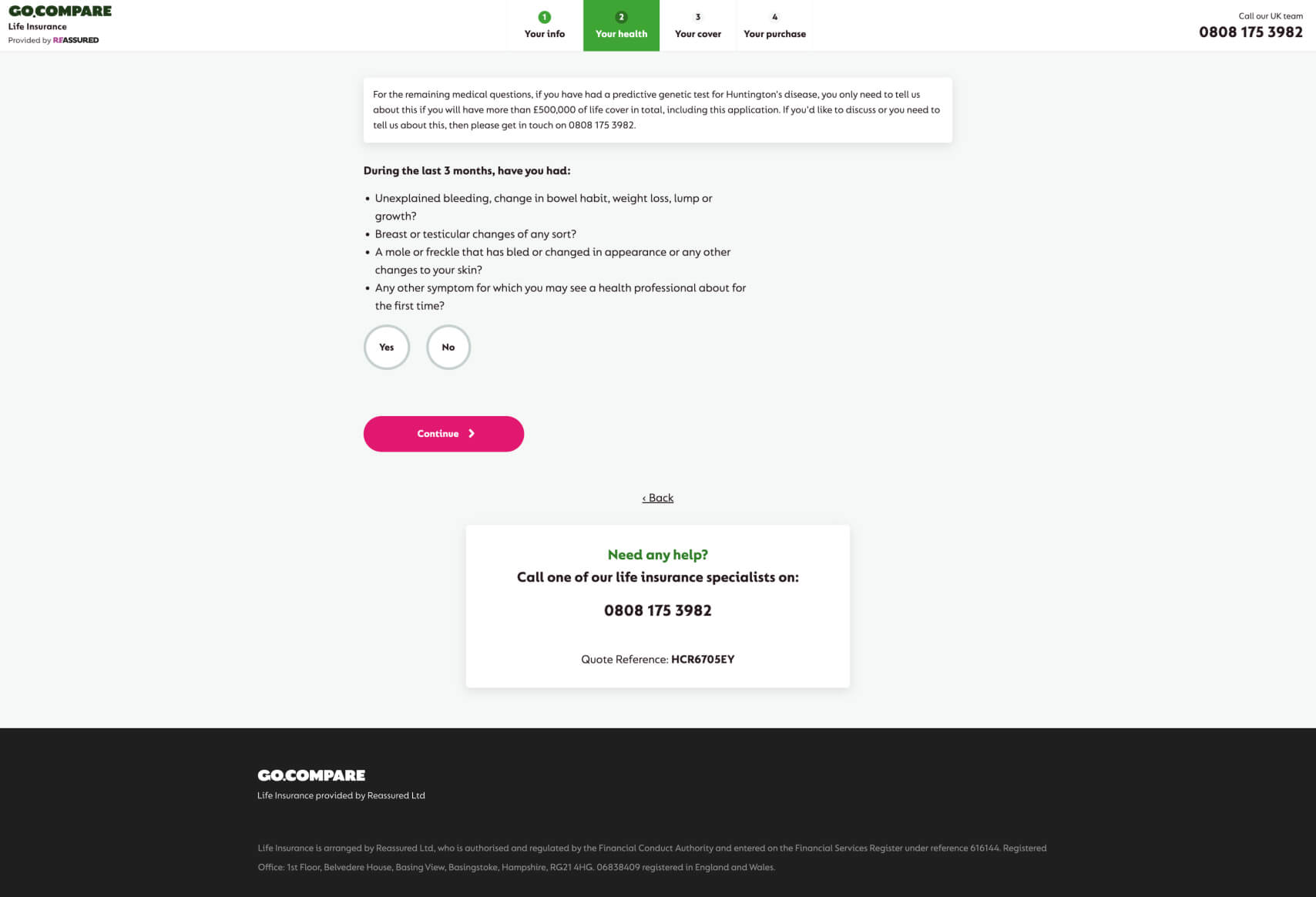
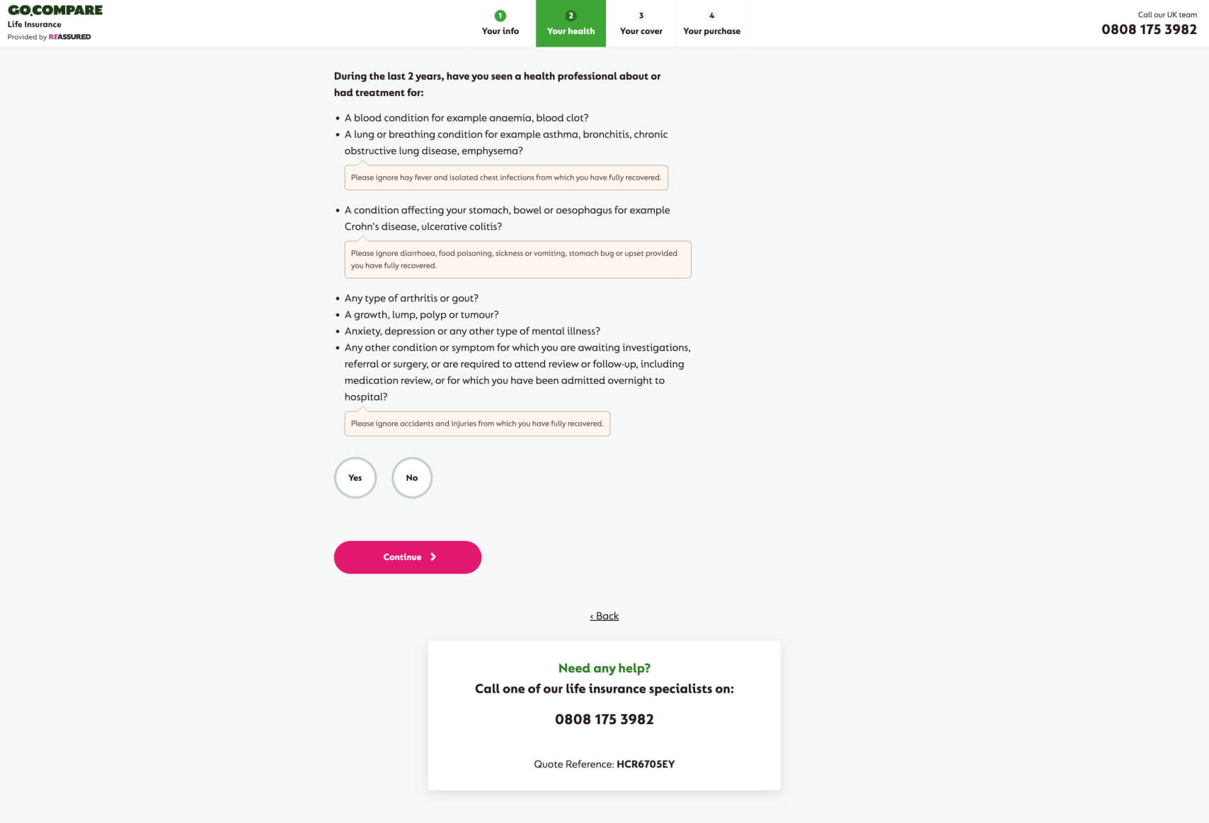
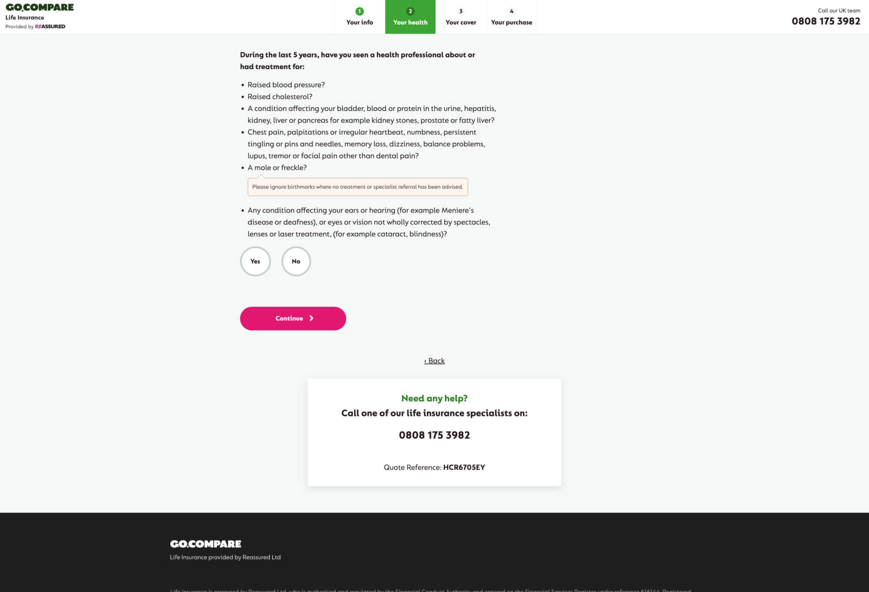
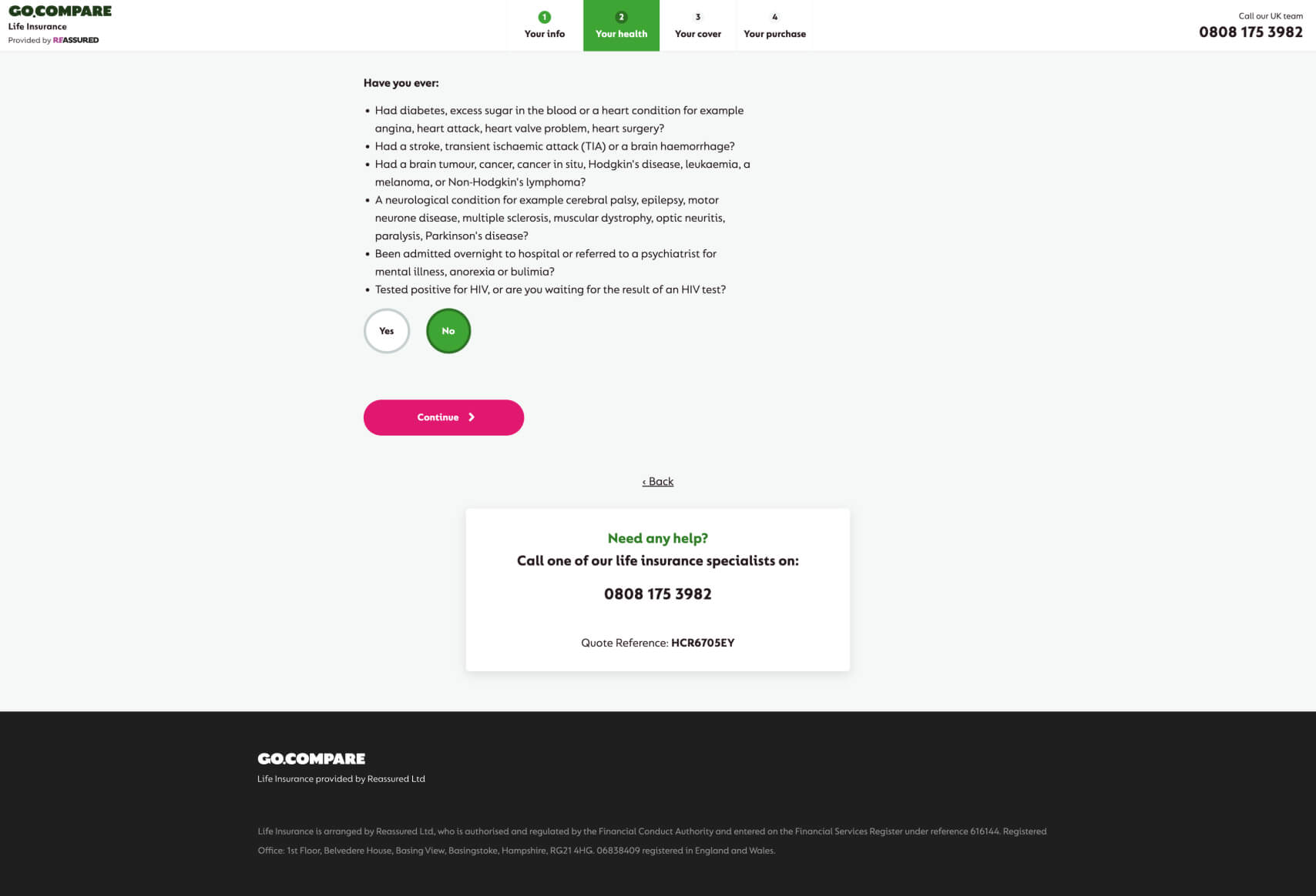
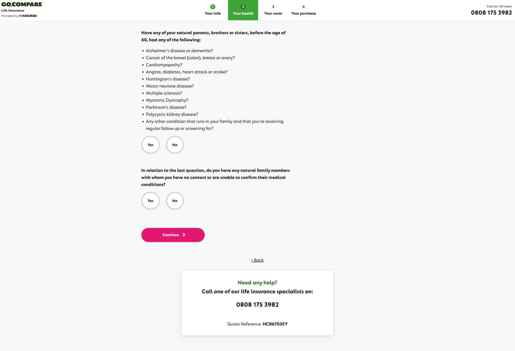
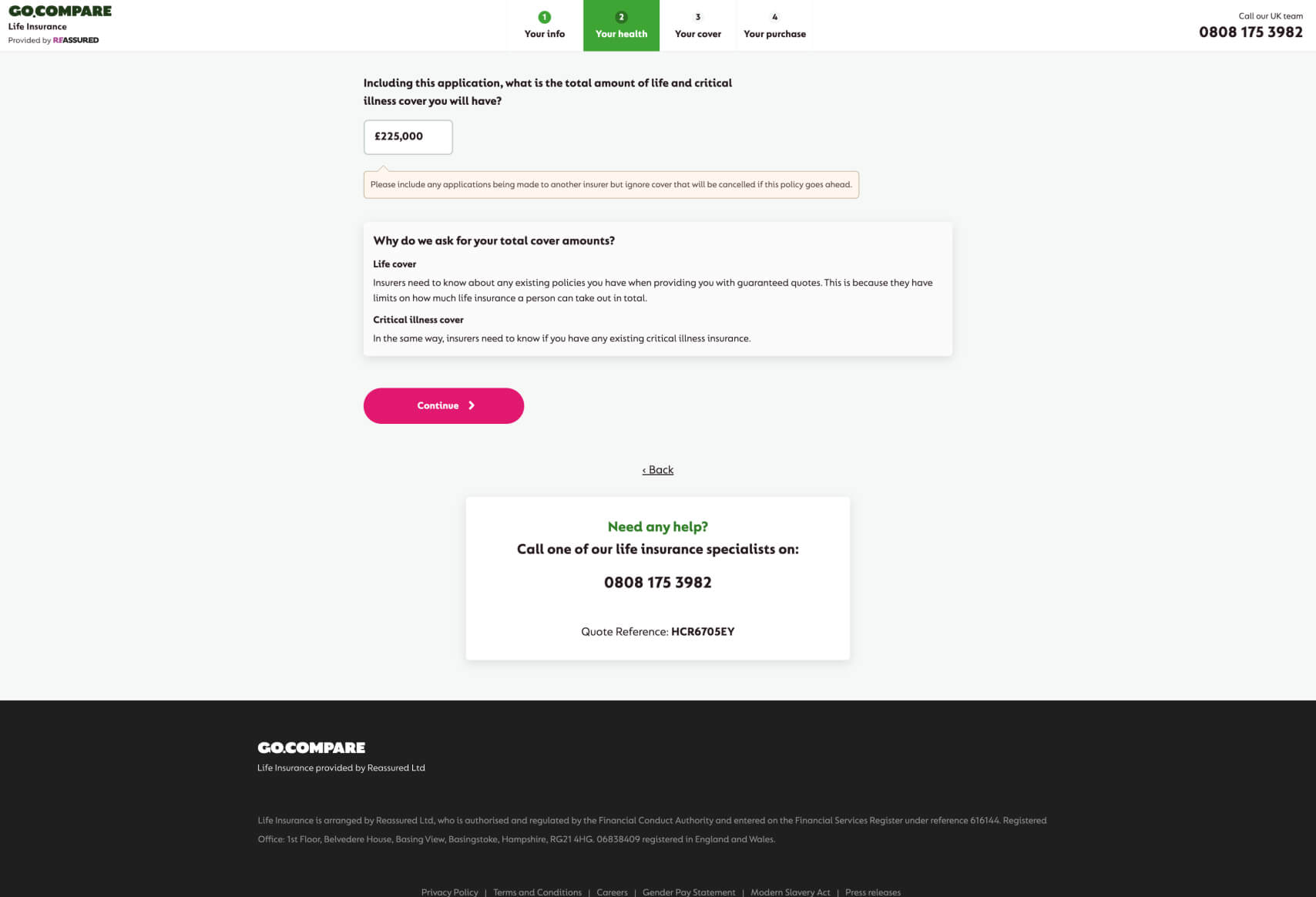
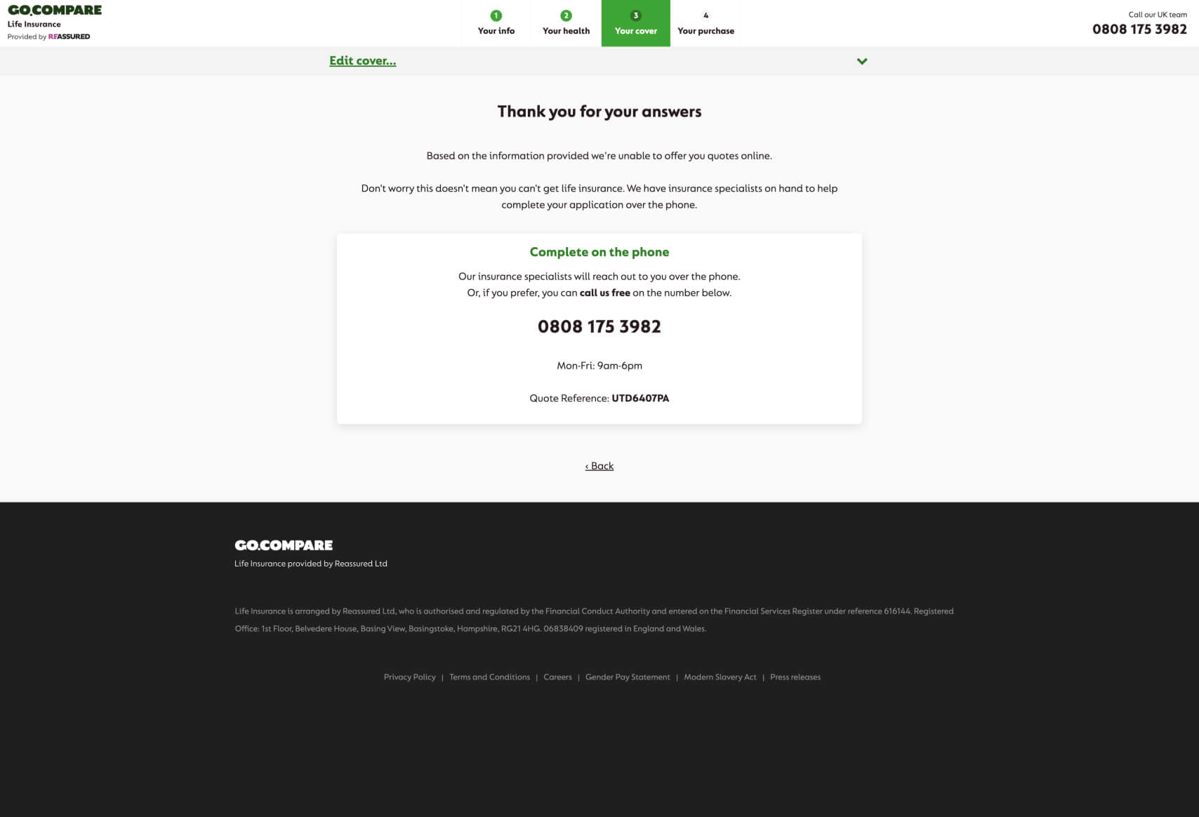
Summary of Reasons Why This Funnel Works:
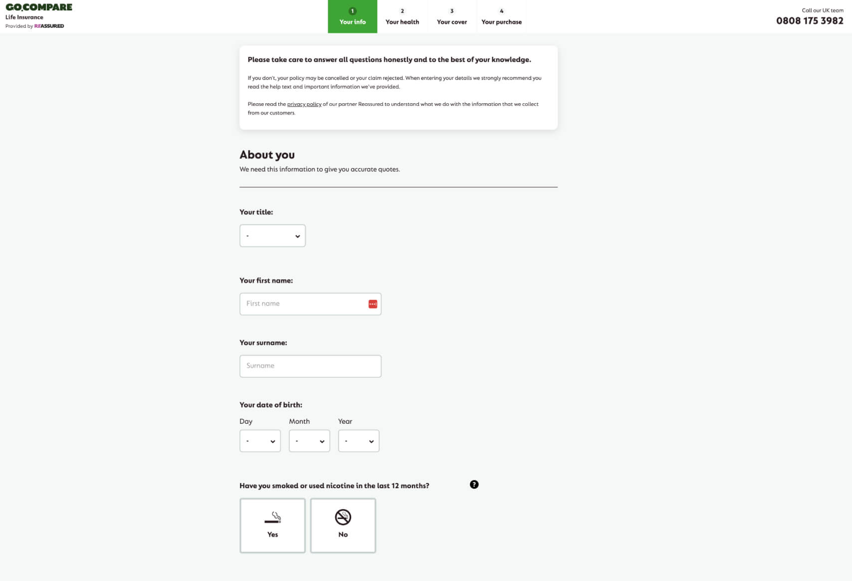
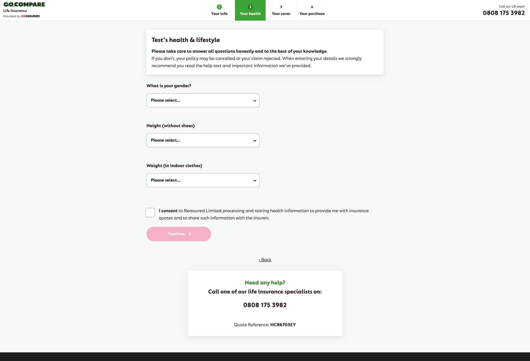
- Step-by-Step Guidance: The GoCompare life insurance funnel breaks down the process into clear, manageable steps— “Your Info,” “Your Health,” “Your Cover,” and “Your Purchase.” This segmented approach reduces user overwhelm and ensures that users can easily track their progress.
- Emphasis on Accuracy and Honesty: Prominently placed instructions encourage users to provide accurate information, which sets the tone for trust and transparency. This is particularly important for life insurance, where precise details are crucial.
- Clear Call-to-Actions: The use of large, bold “Continue” buttons provides a clear path forward, minimizing any confusion about what to do next. The bright pink color makes these buttons stand out, drawing users’ attention and encouraging progression through the funnel.
- Reassurance Through Support: The availability of a dedicated support number at every stage of the funnel, along with a unique quote reference number, offers users reassurance. This ensures that help is readily available, which can reduce drop-off rates due to uncertainty or confusion.
- Simplified User Inputs: The design uses straightforward, easy-to-understand language for user inputs and choices (e.g., “Yes” or “No” buttons), minimizing the cognitive load on the user. This makes it easier for users to provide necessary information without feeling overwhelmed by complex medical or technical jargon.
- Strategic Use of Space: The funnel’s layout is clean and uncluttered, with ample white space. This design choice helps in reducing distractions and keeping the user focused on the task at hand.
Why This Design/Funnel Was Chosen:
GoCompare’s choice to design this funnel with a clear, step-by-step process is likely to enhance user confidence and reduce the intimidation often associated with applying for life insurance. Life insurance is a sensitive and detailed-oriented product, requiring users to provide a significant amount of personal and health-related information. The segmented flow reduces the perceived burden by breaking the process into smaller, more digestible parts. This approach also allows users to concentrate on one section at a time, leading to fewer errors and a smoother overall experience.
The consistent availability of support (via a phone number) at each step underscores the company’s commitment to customer service, making the user feel supported throughout their journey. This is particularly important in industries like insurance, where personal support can play a critical role in conversion rates.
Additionally, the design’s clean and minimalist aesthetic, with ample use of white space, reflects a modern and professional image. This likely appeals to the target demographic by conveying trustworthiness and clarity—key attributes when dealing with life insurance products.
Most Impactful Elements in the Funnel:
- “Have you smoked or used nicotine in the last 12 months?”
- Purpose: This question is crucial for determining the risk profile of the applicant, which directly affects the premium rates.
- Impact: The straightforward yes/no button choice simplifies what could otherwise be a complicated input. It allows users to quickly respond without overthinking, ensuring that the funnel progresses smoothly.
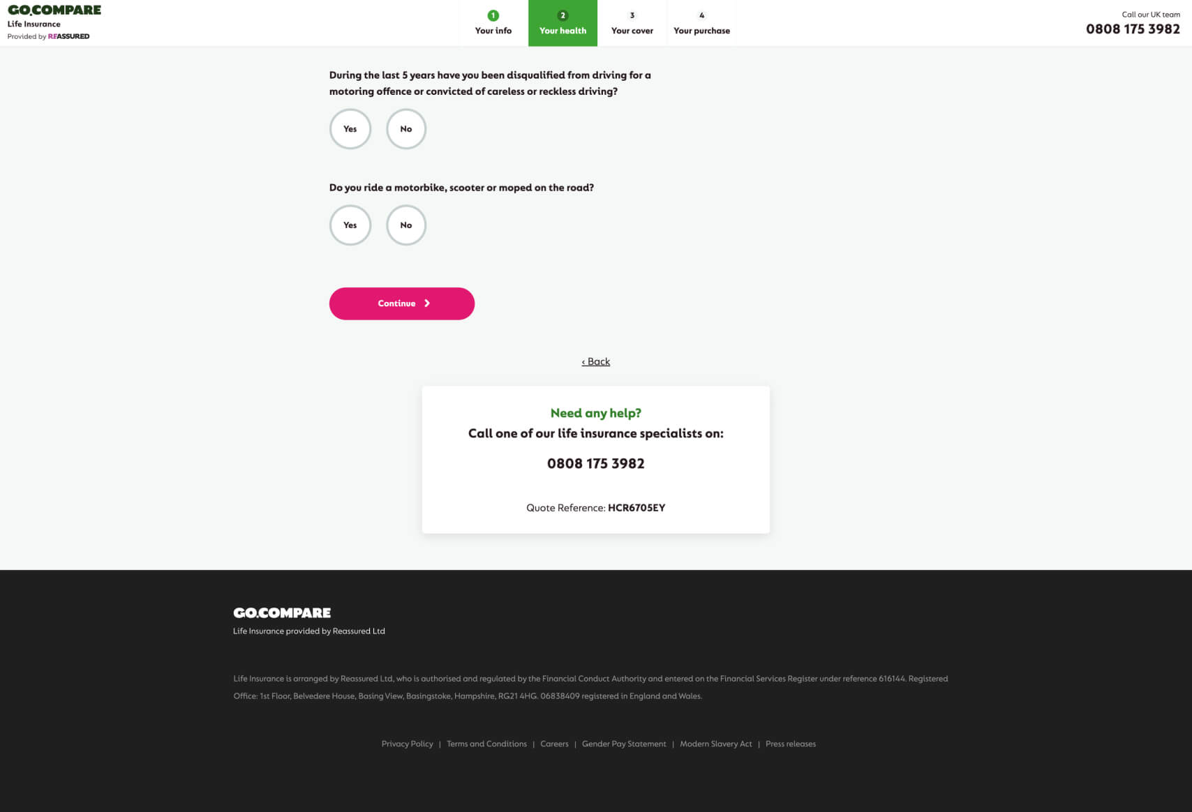
- “Have you been disqualified from driving for a motoring offence?”
- Purpose: This question helps assess lifestyle risks that could influence the life insurance policy.
- Impact: The question is direct and easy to understand, allowing users to respond confidently. The inclusion of such specific questions also shows that the process is thorough, which can increase user trust.
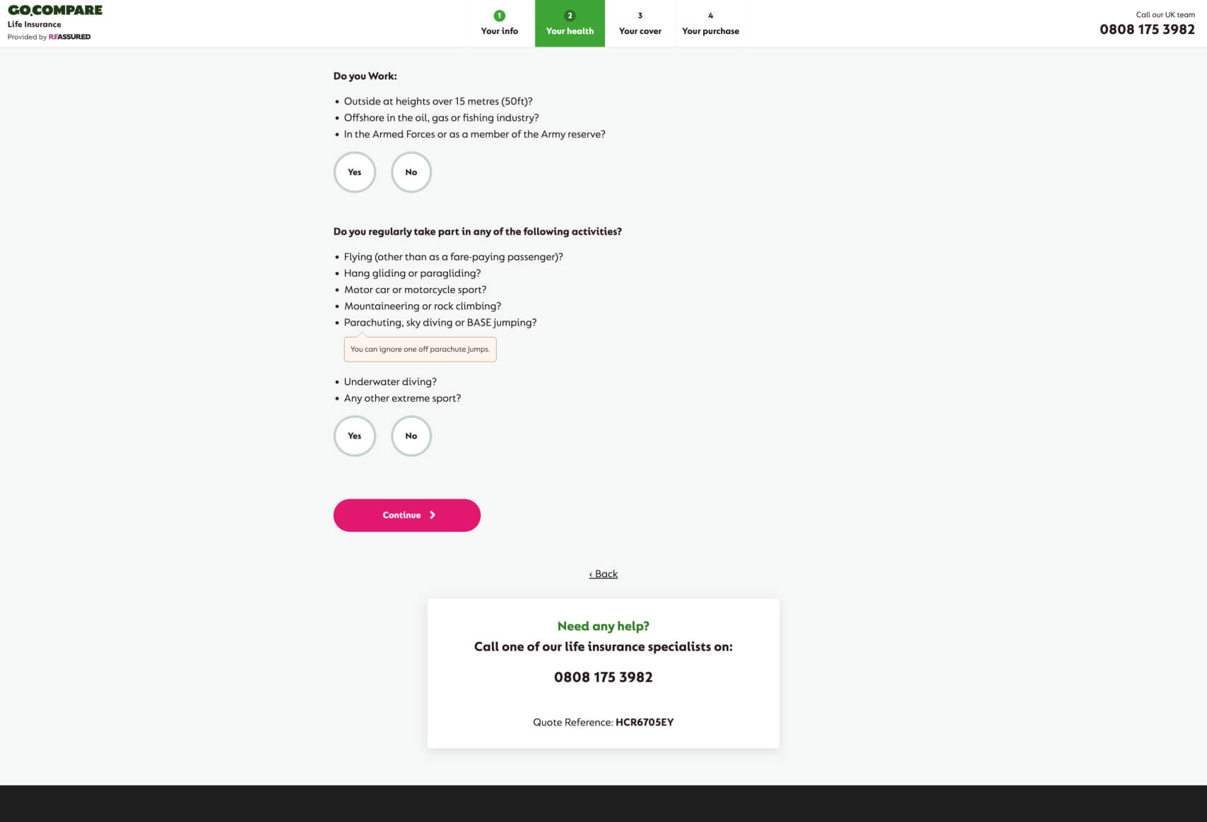
- “Do you regularly take part in any of the following activities?” (Followed by a list of high-risk activities)
- Purpose: This question helps identify any high-risk hobbies that could affect life insurance eligibility or premiums.
- Impact: By providing a list of activities, the funnel helps users quickly identify whether they fall into a higher risk category. This specificity reduces ambiguity and ensures users provide accurate information.
GoCompare’s funnel design is a strong example of how to effectively guide users through a potentially complex and sensitive process with clarity, support, and confidence. The design contributes to an improved overall user experience, likely leading to higher customer engagement. The funnel also incorporates elements of personalization by tailoring questions based on user inputs. For similar effective insurance funnels, visit our Convincely listings.

 No development or design required
  Executed by just adding one line of Convincely code to your website
  Plan and strategize with your team. Execute and deploy with Convincely